Warzone 2100 3d logo for 2014
-
Boris

- Trained

- Posts: 283
- Joined: 24 Apr 2010, 13:52
- Location: About 10 years playing and creating warzone.
- Contact:
Warzone 2100 3d logo for 2014
Warzone 2100 3d logo for 2014
Last edited by Boris on 03 Dec 2013, 22:00, edited 1 time in total.

Re: Warzone 2100 3d logo for 2014
Sorry, but that is very ugly.
-
Boris
- Trained
- Posts: 283
- Joined: 24 Apr 2010, 13:52
- Location: About 10 years playing and creating warzone.
- Contact:
Re: Warzone 2100 3d logo for 2014
for you...show me what you are created.. 


Re: Warzone 2100 3d logo for 2014
"Z" is officially lowercase, afaik.
Maps | Tower Defense | NullBot AI | More NullBot AI | Scavs | More Scavs | Tilesets | Walkthrough | JSCam

Re: Warzone 2100 3d logo for 2014
yep, i m with youSlye_Fox wrote:Sorry, but that is very ugly.
sorry to the artist but this is a 99% fail, because
- there is no unique recognition value (and there is the power of every brand, logo, CI)
- the shape is also a total crap (some letters have brutal errors with the 3d algorythm, or you need more modelling skills)
- somehing like a meshgrid is visible (poor renderer or rendering settings)
- the colors (there is no contrast - at smaller size nobody can't read it), (try to make a icon of this logo - impossible or the same failure)
- the background (warzone is not a chemical drug dealing simulator, so this lsd-party graphics have nothing linked to the game - use it better for making a flyer for some crazy backyard party)
- mirroring, brightness, shaders on the letters (see last argument)
- the depth of the letters is too much or/and the view angle is wrong
but please, don't take my analysis personaly
keep on working, and also look at other logos and brands
(look at some well known brand mutations that took years - and i hope at this point its clear for you why your work is not very convenient)
and try to identify the reasons why something looks nice and something is crap
designing logos is not only how to use graphic programs (or was it just a 3d text plugin from powerpoint or ms word)
but also have psychological secrets of how human brain works, combine, feel, trigger, ... how emotions are linked to visuals and so on
its also a social research, because you have to appeal others not only yourself and you have to learn to look at things from different views too
i hope that helps you a little for your creative process
"unit is under attack!", "unit is under attack!", unit is under attack!" then i wake up ... (true story)


Re: Warzone 2100 3d logo for 2014
Montetank too consider the proposal in need of improvement.
In case the WZ-game ends in a draw , the game winner will be determined by penalty shoot-out.

Re: Warzone 2100 3d logo for 2014
While the effort is commendable, I really don't like it. It just doesn't fit Warzone 2100.
Xfire-->chris37killer
-
Rman Virgil
- Professional

- Posts: 3812
- Joined: 25 Sep 2006, 01:06
- Location: USA
Re: Warzone 2100 3d logo for 2014
.
Agree with duda's comments which are comprehensive, insightful & constructive (good sense of humor too - "LSD party graphics..." )
)
Warzone 2100 has 3 original logo variants which constitute its iconic branding since Eidos handed out the first demos of the game to attendees at the 1998 E3 in Atlanta, Georgia (attatched below).
If you want to mutate a more 3d version, why not work off of them directly rather than trying to create an entirely new branding ?
What would be the upside of entirely discarding the 15 years of original branding ?
Right upfront, that very first decision, I just don't understand.
Logos that stand the test of time tend to elegance and a simplicity achieved through compression, something analogous to a visual haiku. None more so than Nike's.
.
Agree with duda's comments which are comprehensive, insightful & constructive (good sense of humor too - "LSD party graphics..."
Warzone 2100 has 3 original logo variants which constitute its iconic branding since Eidos handed out the first demos of the game to attendees at the 1998 E3 in Atlanta, Georgia (attatched below).
If you want to mutate a more 3d version, why not work off of them directly rather than trying to create an entirely new branding ?
What would be the upside of entirely discarding the 15 years of original branding ?
Right upfront, that very first decision, I just don't understand.
Logos that stand the test of time tend to elegance and a simplicity achieved through compression, something analogous to a visual haiku. None more so than Nike's.
.
- Attachments
-
- Warzone_2100_cover.png (141.64 KiB) Viewed 14839 times
-
- _-Warzone-2100-PC-_.jpg (11.42 KiB) Viewed 14839 times
-
- 1219347.jpg (28.07 KiB) Viewed 14839 times
Last edited by Rman Virgil on 24 Nov 2013, 22:29, edited 1 time in total.
Re: Warzone 2100 3d logo for 2014
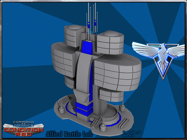
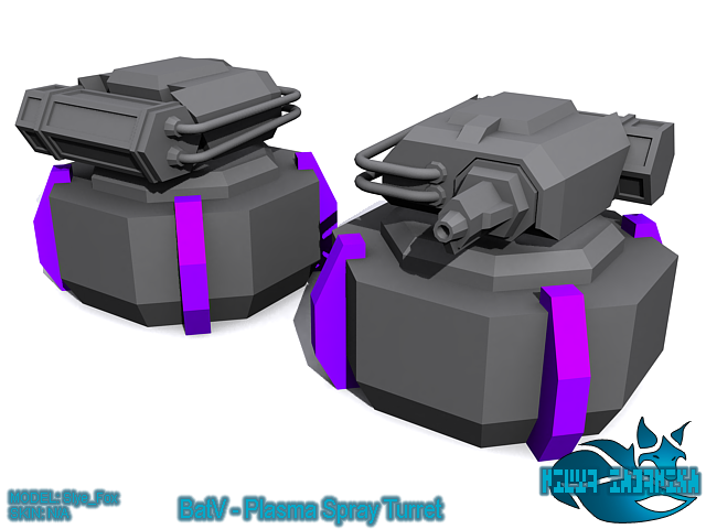
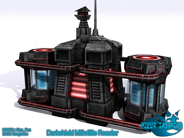
Not done much logo work, just a couple of items:Boris wrote:for you...show me what you are created..

But here is some of my art that is more closer to yours; as in, 3d modelling:
http://media.moddb.com/images/mods/1/10 ... acks.2.png
http://media.moddb.com/images/mods/1/10 ... eDrill.png
http://media.moddb.com/images/mods/1/10 ... hthawk.png
http://media.moddb.com/images/mods/1/10 ... eLab.2.png
http://media.moddb.com/images/mods/1/4/ ... prayer.png
http://media.moddb.com/images/mods/1/4/ ... aPower.png
http://media.moddb.com/images/mods/1/10 ... ined)1.png
http://media.moddb.com/images/mods/1/10/9399/64241.png
-
Boris
- Trained
- Posts: 283
- Joined: 24 Apr 2010, 13:52
- Location: About 10 years playing and creating warzone.
- Contact:
Re: Warzone 2100 3d logo for 2014
bullshit..i create how i like.duda wrote:yep, i m with youSlye_Fox wrote:Sorry, but that is very ugly.
sorry to the artist but this is a 99% fail, because
- there is no unique recognition value (and there is the power of every brand, logo, CI)
- the shape is also a total crap (some letters have brutal errors with the 3d algorythm, or you need more modelling skills)
- somehing like a meshgrid is visible (poor renderer or rendering settings)
- the colors (there is no contrast - at smaller size nobody can't read it), (try to make a icon of this logo - impossible or the same failure)
- the background (warzone is not a chemical drug dealing simulator, so this lsd-party graphics have nothing linked to the game - use it better for making a flyer for some crazy backyard party)
- mirroring, brightness, shaders on the letters (see last argument)
- the depth of the letters is too much or/and the view angle is wrong
but please, don't take my analysis personaly
keep on working, and also look at other logos and brands
(look at some well known brand mutations that took years - and i hope at this point its clear for you why your work is not very convenient)
and try to identify the reasons why something looks nice and something is crap
designing logos is not only how to use graphic programs (or was it just a 3d text plugin from powerpoint or ms word)
but also have psychological secrets of how human brain works, combine, feel, trigger, ... how emotions are linked to visuals and so on
its also a social research, because you have to appeal others not only yourself and you have to learn to look at things from different views too
i hope that helps you a little for your creative process
-
Boris
- Trained
- Posts: 283
- Joined: 24 Apr 2010, 13:52
- Location: About 10 years playing and creating warzone.
- Contact:
Re: Warzone 2100 3d logo for 2014
your models don't have any textures,light and reflect ..shape is simple work..Slye_Fox wrote:Not done much logo work, just a couple of items:Boris wrote:for you...show me what you are created..
But here is some of my art that is more closer to yours; as in, 3d modelling:
http://media.moddb.com/images/mods/1/10 ... acks.2.png
http://media.moddb.com/images/mods/1/10 ... eDrill.png
http://media.moddb.com/images/mods/1/10 ... hthawk.png
http://media.moddb.com/images/mods/1/10 ... eLab.2.png
http://media.moddb.com/images/mods/1/4/ ... prayer.png
http://media.moddb.com/images/mods/1/4/ ... aPower.png
http://media.moddb.com/images/mods/1/10 ... ined)1.png
http://media.moddb.com/images/mods/1/10/9399/64241.png
here is some my models http://artist-3d.com/free_3d_models/dnm ... ount=count
Last edited by Boris on 25 Nov 2013, 19:57, edited 1 time in total.
Re: Warzone 2100 3d logo for 2014
The best thing you can do is accept the criticals which where made in a constructive way and improve it =) getting angry with this is child stuff =P
Re: Warzone 2100 3d logo for 2014
Boris: You need to have more modest expectations, the reason you're getting quite a bit of critique is because you are essentially claiming you have made something to replace a very important logo.
The fact that you have made enough progress to produce a rendered logo is nice, but we can also see many things you still need to learn about. Would you have simply claimed that you are learning 3d stuff & doing fan-art, nobody would have called it ugly, because they wouldn't be expecting (almost)professional-level work.
The fact that you have made enough progress to produce a rendered logo is nice, but we can also see many things you still need to learn about. Would you have simply claimed that you are learning 3d stuff & doing fan-art, nobody would have called it ugly, because they wouldn't be expecting (almost)professional-level work.


-insert deep philosophical statement here-
-
Boris
- Trained
- Posts: 283
- Joined: 24 Apr 2010, 13:52
- Location: About 10 years playing and creating warzone.
- Contact:
Re: Warzone 2100 3d logo for 2014
i don't replace anything ,this is just for suggestion..
- Attachments
-
- wzclasiclogo.png (264.08 KiB) Viewed 14777 times
Re: Warzone 2100 3d logo for 2014
Very well then, keep it up 
-insert deep philosophical statement here-