some hi-res graphic remake


Re: some hi-res graphic remake
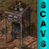
Fans in factory have been modified
Same textures as above in trunk version.
- Attachments
-
Re: some hi-res graphic remake
I consider Page 12 finished
I did not modify the walls as some has been changed for walls in this thread
I did not modify the walls as some has been changed for walls in this thread
Re: some hi-res graphic remake
I have been redoing page 13 and open testing it there is some strange colours in the game.
I don't know what is making this I checked my textures several times
I don't know what is making this I checked my textures several times
Re: some hi-res graphic remake
Well, one of those lines is a problem with the pie file of the factory, I'll fix it.
"...If pure awesomeness were bricks, this would be the Great Wall of China...
The glory of this has collapsed on its self so far, that even the neutrons have collapsed."
The glory of this has collapsed on its self so far, that even the neutrons have collapsed."


Re: some hi-res graphic remake
The round cylinder things look a bit weird.
Re: some hi-res graphic remake
By the looks of things,1 on that picture isn't related to the model at all. I'm not sure what is causing that, shadows maybe?
The bit that isn't your texture, I haven't been able to reproduce either. Which version were you playing?
The bit that isn't your texture, I haven't been able to reproduce either. Which version were you playing?
"...If pure awesomeness were bricks, this would be the Great Wall of China...
The glory of this has collapsed on its self so far, that even the neutrons have collapsed."
The glory of this has collapsed on its self so far, that even the neutrons have collapsed."
Re: some hi-res graphic remake
Running in latest trunk with 2048 tile setting
The round cylinder thing the body of it i have not changed.
The change to it was the Fan on top.
I think you might find its just the direction it is viewed from
I will change that later as the default texture looking from that direction is actualy almost black.
That is a cooling tower.
I do like the word "thing" because its a technical term
Re: some hi-res graphic remake
Yeah, I don't like the new fan on top - it's a bit too dark.
Re: some hi-res graphic remake
The original fan was a sorta grey blob and darker then that one.
With the original and the new its a matter of contrast the old was very plane when you can see the detail it changes your perspective the colours look darker when they are light etc
here is a screen shot with new tower under the fan.
The size of the images is relevant to. So I like the feed back I can work on likes and dont likes it is lot better then wondering if its good.
Maybe there can be a art dicussion on IRC and dev folks let all us wonabee's know the direction the project is taking.
- example.gif (19.58 KiB) Viewed 7454 times
here is a screen shot with new tower under the fan.
The size of the images is relevant to. So I like the feed back I can work on likes and dont likes it is lot better then wondering if its good.
Re: some hi-res graphic remake
Look at the original tower more closely. Taken as a whole, it's clearly lighter. It's also not a fan. :/Berg wrote:The original fan was a sorta grey blob and darker then that one.
With the original and the new its a matter of contrast the old was very plane when you can see the detail it changes your perspective the colours look darker when they are light etc
here is a screen shot with new tower under the fan.
We don't want the cylinders to be high contrast. We use contrast to draw attention to important things, such as units. You can make the new cylinders slightly higher contrast, but no more.
Re: some hi-res graphic remake
What is it. I realy thought it was suppose to be a fan.
I will make it a cylinder or what ever,(need to define what a lot of things are) that new frame is not finished it needs ladders and pipes added Plus shadows to bring the brightness down.
I'm needing to define the look also I agree that you want to focus on the factory but need to start some place so I put these up for input.
Re: some hi-res graphic remake
Progress report
back and front of factory
back and front of factory
Re: some hi-res graphic remake
The top is now too smooth, and there's too much contrast everywhere. :/ Tone it down. Just upscale the current one if you have to. And the sides of the cylinder, they still look a bit weird.
Re: some hi-res graphic remake
The front view is to bright? of cylinder=
The back view is to dark? of cylinder=
want the top to be segmented like its plated?
The back view is to dark? of cylinder=
want the top to be segmented like its plated?
Re: some hi-res graphic remake
Both, I think.